Last weekend, I enjoyed two webinars by Tim Janzen that were part of MyHeritage’s One-Day Genealogy Seminar with Legacy Family Tree Webinars. Tim gave an introductory talk and an advanced talk on the use of Autosomal DNA Testing.
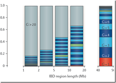
In both talks, Tim showed the well-known and often referred to Speed and Balding diagram which I’m showing here:
It is also highlighted on the ISOGG Wiki Identical By Descent page, where it says:
“A study by Speed and Balding (2015) using computer simulations going back for 50 generations showed that over 50% of 5 mB segments date back over 20 generations, and fewer than 40% of 10 mB segments are within the last 10 generations. Larger segments can still date back quite some time and it was found that around 40% of 20 mB segments date back beyond 10 generations.”
This analysis is quoted often. It illustrates that small segments are very distant, and even larger segments can be quite distant.
The diagram is from Figure 2B of a paper published online in Nature Reviews Genetics on 18 Nov 2014 by Doug Speed and David J Balding titled “Relatedness in the post-genomic era: is it still useful?” Their entire article has now been made available by Doug Speed at his website. The article is very technical and uses a lot of statistics which will make it impossible for the average person to read. But let it be known that their analysis is well done.
It’s a strange looking chart which demands some explanation. On the X axis are IBD (Identical by Descent) region lengths in Mb. A segment passed down to two people from a common ancestor is IBD. The Mb are million base-pair. 1 Mb is close enough to 1 cM (centimorgan) which approximates the probability of recombination in one generation.
Since recombination occurs each generation, large segments get subdivided. Jim Bartlett gives an excellent example in his Segments: Bottom-Up article. Therefore, segments you get from each ancestor will tend to get shorter the further back you go.
So the Speed and Balding chart is showing ranges of segment length on the X axis and the probability of occurrence on the Y axis. It then stacks the probabilities of each generation having each range of segment length, and color codes each generation. G=1 is shown in red. G=2 to G=9 is shown in alternating dark blue and light blue colors, G=10 is shown in green to highlight that generation, G=11 to G=20 continues with alternating dark blue and light blue colors and G>20 is shown in gray.
Reading the chart, you can make conclusions that for IBD segments between 10 and 20 Mb, only 40% are from an ancestor within 10 generations and 30% are from an ancestor more than 20 generations back. For IBD segments between 5 and 10 MB, only 10% are from an ancestor within 10 generations and 50% are from an ancestor more than 20 generations back.
Incorrect Application of Their Results
This chart is being used by many genetic genealogists to help them conclude that small segments will often yield ancestors that are too far back to be genealogically useful. Matching segments under 5 or 7 cM are often called too small to be of practical use. For endogamous groups, 20 cM or even 30 cM may be called too small.
Speed and Balding’s study was one of descendancy. Their Type B simulation was used for their Figure 2b. They started with 5,000 males and 5,000 females and simulated 50 generations of descendants.
Their simulations are good. Their analysis and statistics are good.
However, their results refer to the final 50th generation of descendants. They calculate the number of generations of IBD each of those people in the final generation have with each other. They state in their paper:
Under the coalescent model, the MRCA of two haploid human genomes at a given site is unlikely to be recent. … In our Type B simulation model, the probability of an MRCA in generation G is … which supports the assumption that people are unrelated if nothing is known about them.
The bottom line is that the Type B simulation data that is summarized for their Figure 2B was including all 6th, 7th, 8th cousins and more and adding their instances to the probability of the instance’s segment length for that particular generation back to the ancestor (G = 7, 8, 9, …)
That is not wrong on their part. But it is wrong to apply their results to our match data from a DNA testing company.
DNA Testing companies screen our matches. They don’t include everyone because they only want to include likely matches. Each company has their own criteria for inclusion. Family Tree DNA for example, will only include a person as a match if they have at least one segment that is 9 cM, or if they have at least one segment that is 7.69 cM and the total shared is greater than 20 cM.
If you take a look at Figure 2Ab in Speed Balding, they show their simulated probability of each region length at 10 generations:
Through inspection, only about 5% of the segments are above 8 or 9 Mb. This implies that only 1 out of 20 people who have a common ancestor at 10 generations back will be identified as a match with you.
Recalculating Speed Balding
We need to apply Speed and Balding’s information, but need to do so for only the people who will show up to you as matches. We need some data to do this.
Unfortunately, Speed and Balding produced Figure 2Ab for 10 generations (shown above), and Figure 2Aa for 1 generation. They do not give the data, but do indicate that the distributions can be approximated by a gamma distribution, which is:
The value of that gives the probability
for x > 0, where x is the IBD region length in Mb.
k is the shape parameter.
Theta is the scale parameter.
In a Gamma distribution, theta can be calculated as the mean / k;
The letter at the bottom left of the equation before “(k)” is the gamma function.
The paper says the shape parameter k is approximately 0.76 for any G.
It says the mean of the distribution is Equation 4, but that is the expected number of IBD segments. The paper should have said Equation 5, which is the mean length of IBD regions which is what is wanted. Equation 5 is:
where G is the number of generations back.
Therefore theta is this mean value divided by k.
Sorry about all this horrendous maths/stats, but I wanted to show that we now have all the calculations we need to build the approximate probabilities for each IBD region length (Mb) for every G that was used in the paper:
Look at the row where G=10. You’ll see that the values for Mb = 1, 2, 3, … which are 0.191618, 0.134511, … correspond to the black line (gamma distribution estimate) of the green bar chart above for Common Ancestor 10 Generations Back (Speed and Balding Figure 2Ab).
Converting this to Speed and Balding Figure 2B
Now the tricky part.
The paper says it uses a second simulation to get its information for figure 2B. Statistics and the approximate probabilities above should be able to give something close. The clue as to what they are doing is given in their statement that this is the “Inverse Distribution”. i.e. Figure 2A’s distribution is:
Probability(region length) for G = 1, 2, 3, …
They are determining what they are calling the inverse distribution:
Probability(G) for region length = specific ranges
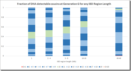
I can group the IBD region length probabilities into the same region lengths as Figure 2B, and I’ll make the following groups: 1 Mb, 2-4 Mb, 5-9 Mb, 10-19 Mb, 20-29 Mb, 30-39 Mb and 40-49 Mb. I can then total the probability of each group for any G and divide that by the total of the column to get the average probability of getting a specific G within a Mb group. Then I can stack those and I get the following:
The numbers are a bit different because (a), theirs is a simulation and not statistics, and (b) the gamma distribution is only an approximation of the simulated distribution, and (c) I only used integer values of IBD region length, whereas their model used real numbers. But this is still reasonably close to the Speed Balding Figure 2B at the top of this post.
This makes me quite confident that the results of their simulation were summarized in a compatible way to give their Figure 2B.
The critical G=10 region shown in green that everyone refers to is a bit higher on the probability model of my estimate, but that difference is well within margins of error and wouldn’t change any conclusions arising from this chart regarding small segment.
Oh Oh.
There’s one critical problem with this analysis. Did you see it?
Their probability distribution values for region length cannot be directly used in an inversion in this manner. The probability distributions of region length are dimensionless. It is a probability that you must first apply to a number of observations. The number of observations you will have for each G is not constant. You have a lot more relatives at G = 6 than you have at G = 1.
Incorporating the Likelihood of IBD DNA being detected.
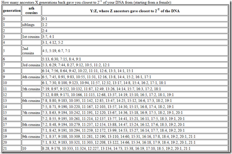
What needs to be done is to multiply each of the probability values by the number of relatives you’ll have at G = 1, 2, … I can get such values from this table on the ISOGG Cousin Statistic page:
I can use the “Expected number of cousins” column and expanding it further out to 50 generations. Each generation according to the table multiplies the previous number by about 5. But this has to start slowing down at about 8 generations or you will quickly run out of people in the world. So I slowed the expansion down until it maximizes at generations 16 and 17 with a billion cousins, and then starts decreasing after that. Total number of people: about 6.7 billion:
Now I multiply this against the Gamma distribution estimates that I had for each value of G, and group them giving these counts:
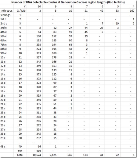
We’re not done yet. Once you get out to 3rd cousins and further, there is no longer a certainty that you will share any DNA with these relatives. You have to multiply every generation level by the probability that you will share at least some DNA. You can get that also from the ISOGG table I linked to above. The table can be extended at the end by dividing the probability by 4 for every additional generation. Then that probability is multiplied by the number of cousins (above) to give the expected number of detectable cousins, below:
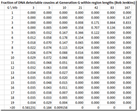
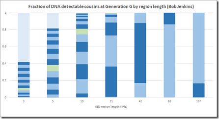
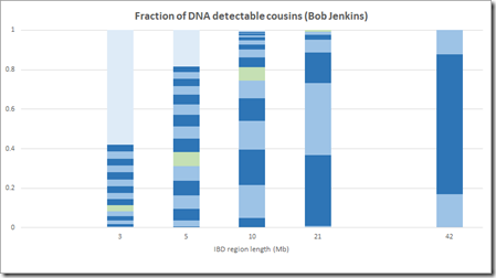
By dividing each column value by the column total, we can get the numbers needed that we can display in Speed and Balding format:
This is now a very different picture. Now most segments of any length come from a common ancestor 10 generations or less back. Even at the 1 Mb level, there are very few segments that come from further than 15 generations back.
This makes sense when you think about it, because segments 15 generations back have a miniscule chance of being shared between two people. In case of pileups coming from endogamy or a very distant prolific ancestor maybe 50 generations back (as in the Speed and Balding simulation) it’s very likely that there is a closer common relative somewhere in between that will be within 15 generations. Maybe Speed and Balding didn’t account for these when summarizing the simulation data – I don’t know.
Conclusion
I believe the above calculations and chart are correct using the Speed and Balding distribution data along with ISOGG’s generational data for the number of cousins and likelihood of DNA detection. It properly represents the DNA that you would match at different segment sizes for different generations.
Speed and Balding’s chart cannot be verified since they did not provide the details to do so, but inverting the distribution the way their simulation results might have been analyzed gives similar results to what they show.
I believe Speed and Balding’s chart greatly overestimates the number of generations that IBD segments came from. Their chart says that the >20 generation group makes up 50% of the IBD segments between 5 Mb and 10 Mb. Their >20 generation group remains a significant percentage of segments right up to 40 Mb segment length which I find very hard to believe, especially if we’re just talking about people who you match with.
Incorporating the likelihood of detecting DNA corrects what is not right with Speed and Balding’s Figure 2B and better represents the fraction of IBD DNA that can be expected to come from different generational levels in any Mb group.
All comments, criticisms and suggestions are welcome.
Figures 2Ab, 2B, Equation 5 and quote of text is reprinted by permission from Macmillan Publishers Ltd: Nature Reviews Genetics, Nature Publishing Group, Nov 18, 2014, copyright © 2014
—–
Followup: 10 days later (Nov 15), I have posted additional information in a new post: Another Estimate of Speed and Balding Figure 2B.
Update: Nov 16 – I made the correction pointed out by Andrew Millard on the ISOGG Facebook group, that it is the degree of cousinship on the ISOGG table I used, and the G should be 1 more than that number. I’ve updated all my tables and charts. The change it makes is small and does not change any of my observations or conclusion.
The ISOGG Facebook group is a closed group, but if you have been given access to it, the comments there about this article are a worthwhile read.