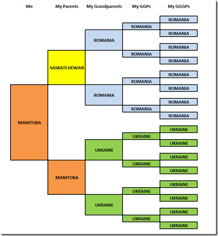
This seems to be the current meme going around. Put together an ancestral birthplace chart of the states and countries your ancestors are from.
Many people have very interesting and diverse backgrounds.
Not me. Mine’s not too exciting:
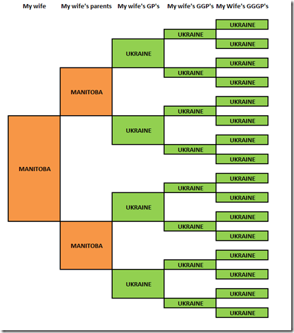
And my wife’s is even less so:


Joined: Fri, 9 Jan 2015
6 blog comments, 0 forum posts
Posted: Mon, 28 Mar 2016
Louis,
I believe that the above is a very unfortunate way to display ancestral birth places. It doesn’t take into account that countries come and go, that territories change hands through wars, that political structures are turned upside down. A lot of background information is lost this way since you do not show the historical context in which your ancestors lived.
In your wife’s case for example it should’ve shown Canada — Ukraine — USSR — Poland — Russian/ Austrian-Hungarian Empire — Polish–Lithuanian Commonwealth — and so on. Looks much more diverse to me now.
-Uwe
Joined: Sun, 9 Mar 2003
291 blog comments, 245 forum posts
Posted: Mon, 28 Mar 2016
Uwe: True country-wise. But if I did it by town name, it would be boring again.