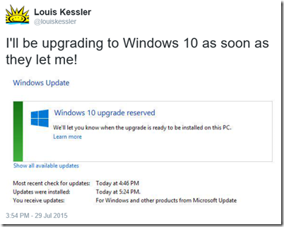
Windows 10 first released on July 29. It was a staged release, being rolled out in phases to help manage the demand. I had “reserved” my copy early, like millions of others, and was anxiously awaiting it telling me my upgrade was ready. I even tweeted this:
So then I waited, and waited, and waited, as everyone else I knew were getting their upgrades, but not me.
Finally, yesterday morning, my upgrade was ready for my machine. It took about two hours in total and I was up and running. I had to update my printer and scanner drivers, but other than that, everything was working.
Next was to check Behold and see if it had any problems. I didn’t expect so because Delphi XE8 was made to be ready for WIndows 10 and nobody reported any problems. Sure enough, Behold compiled fine and runs okay, no faster, no slower.
But there is an appearance difference. This is due to the themes of Windows 10. Under Windows 8.1, The top part of Behold’s main window looks like this:
But under Windows 10, it looks like this:
The blue border is gone, the title is left justified and smaller text, and the controls on the right are larger and more spread out.
I didn’t like this, but it’s the Windows 10 style. The rules of UI generally are to respect the themes that a person picks and not overrule them. It seems like this is the way Behold is now going to look. Even Notepad looks the same:
So I resigned myself to this fate, and started preparing to update the Behold User’s Guide to include revisions for version 1.2 with screenshots from WIndows 10. Then I opened Microsoft Outlook and I saw:
And Word and Excel and Powerpoint look similar but with a different header color. I guess the Microsoft Office developers did not like the new Windows 10 styling and overrode it.
I wonder if I should, too. Any thoughts?


Joined: Fri, 20 Jul 2012
20 blog comments, 3 forum posts
Posted: Mon, 23 Nov 2015
I am not at all impressed with Win 10, how it looks or how it operates. My vote would be for the classic look. It’s comfortable and much easier on the eyes. Newer is not always better.